BSPK: a design system from zero to open source
How I built Anywhere Real Estate's design system for ten brands, kept accessibility working when the people around it changed, and open-sourced it early enough that teams were still asking for upgrades after the funding ended.

- 86React components
- 10Brand themes, light and dark
- 62Releases
- 1,612Icons, 97 of them custom
- 2Frameworks, one set of stylesheets
- CC BY 4.0Open source license
Two design systems on every project
When I joined the design system effort at Anywhere Real Estate in late 2024, there was a lot of Figma and no front-end code. The design team had been working on Bespoke in Figma since 2023. Nothing had been built.
I joined as the only engineer on it and built the first components alone. By mid-2025 I was leading a team of three.
That gap was costing every product team. When the design lead asked me what to tell the CTO, I put it this way: before Bespoke existed, every project already had to develop against two design systems. One was the one-off system the project designer created in Figma. The other was whatever component library the developers had to tame, bend and cajole to match that designer's vision.
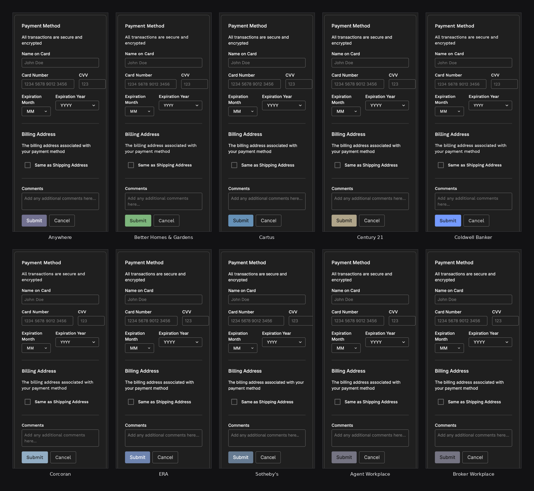
Bespoke, or BSPK in the repos and package names, was meant to replace both with one system every product team could use, and there were dozens of them. It had to serve ten brands that share infrastructure but not identity: Century 21, Coldwell Banker, Sotheby's International Realty, Corcoran, ERA, Better Homes and Gardens, Cartus, and three internal products. One component library had to carry ten identities without becoming ten libraries.
Build or adopt
The first real decision was whether to build at all. At that point it was still just me, so these were my calls to make and my calls to defend.
I evaluated Material UI first. The problem wasn't quality, it was surface area. Material ships so many features that I would have spent more code turning off what I didn't want teams reaching for than it would take to build the components myself. Any accessibility gaps would also have been mine to work around rather than fix.
I looked at shadcn/ui next. Copying components into each app gives teams a lot of freedom, but that freedom is the thing a design system exists to limit.
Ten brands with ten slowly drifting copies of the same button isn't a system.
The stronger alternative was a headless library: Radix, React Aria, Ark. They would have handed me focus management, keyboard behaviour and ARIA for free, and I passed on them for a different reason. Each one is a second API your engineers have to understand underneath yours. A team debugging a BSPK select would have been reading our props, then the headless library's hooks, then the DOM. I wanted one layer between the developer and the browser, and a library small enough that the whole thing fit in one person's head. The cost was writing the keyboard and focus behaviour myself, which is exactly why the accessibility checks described below had to be automatic rather than optional.
Building also meant I could shape the API around how the product teams actually worked. Most libraries hand you a parent component and expect you to compose the children yourself. Our teams were rendering lists from data, so a select or a checkbox group takes an array of options and renders them, instead of making every team write the same mapping code against the same shape. You give up some fine-grained control and get back speed, and more importantly you get consistency, because there's one way to build the thing rather than thirty.
So I built from scratch, with as few dependencies as I could. The React library has six runtime dependencies: Floating UI for positioning, date-fns, focus-trap-react, libphonenumber-js, and our own icon and style packages.
Figma to ten brands
Designers owned the tokens in Figma variables, so that's where the pipeline starts.
Here too the decision was build rather than adopt, and this time for a concrete reason. The Figma file had a mode structure the general-purpose token tools handled badly: ten separate brand theme collections, each carrying its own light and dark modes, aliasing into a shared brand collection and a set of global primitives, with a breakpoint collection on top. Resolving one token meant following its alias across collections, where the target's value depended on a different collection's active mode. Rather than bend a general tool around that, I wrote a Figma plugin that exports every variable, mode, text style and effect style to JSON. A Node build turns that export into one CSS file and one typed TypeScript file for each brand, with light and dark modes and a type scale that changes at 640 pixels.
Every generated CSS variable keeps its Figma name as a comment, so any token can be traced across all three places it lives: the Figma variable a designer edits, the CSS custom property a component uses, and the typed TypeScript token. A designer and an engineer can search for the same string and land on the same thing.
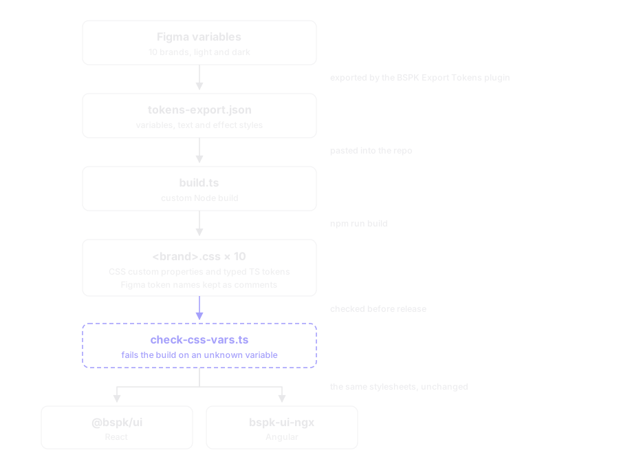
There are no hex values anywhere in component styles. Every color comes from a token. A build check fails if a component references a CSS variable that doesn't exist in the token output, so when design renames a variable in Figma, we find out at build time rather than in production.
Dogfooding the docs site
The obvious choice for component documentation was Storybook. I didn't use it, and that was deliberate.
Storybook arrives with its own interface and its own design language. Our docs site would have looked like Storybook with Bespoke components sitting inside it, when the whole argument we were making to dozens of product teams was that this system was good enough to build real things with. So I built the docs site out of BSPK components, which is dogfooding in the most literal sense. The navigation, the tables, the tabs, the search, the theme switcher: all of it is the library documenting itself.
Dogfooding turned the docs site into the harshest test we had. If a component regressed, the documentation for it broke in front of everyone. When we changed the radio group, the way the docs site used it in its own settings exposed visual problems that no isolated example would have shown, and we fixed them before any product team saw them.
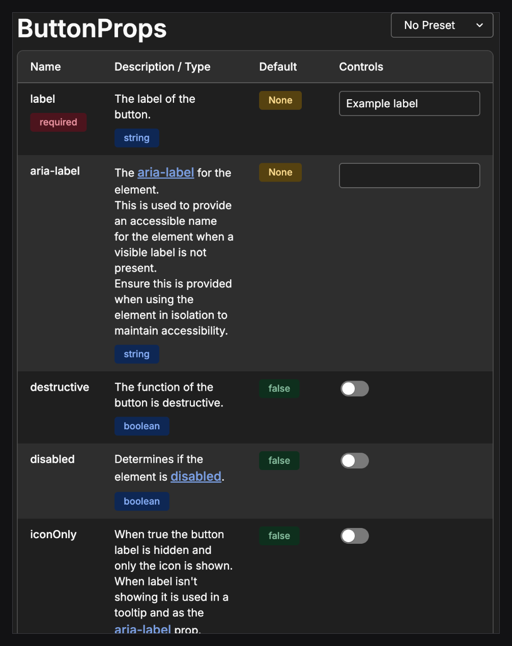
It also let the site do things a generic tool wouldn't. Every example has a live code editor, so you can rewrite the example into the shape your screen actually needs. Prop tables are generated from the TypeScript types and JSDoc, so the documentation can't drift from the code. Each component carries its lifecycle phase, from backlog through development and UX review to stable, so a team could see what was safe to build on. And axe-core runs on whatever you write in the editor.
Component APIs are for developers
From December 2024 to June 2025, the design team reviewed every component my team and I had built, directly in the docs site, and left 374 comment threads in Figma. I answered 354 of them, and the reply usually carried the version it shipped in.
That record is the best picture I have of how I design component APIs, because nearly every conversation came back to one idea.
Figma components and code components have different users.
A designer toggles a call-to-action on or off. A developer needs the button's label and what happens on click. So in code the call-to-action is an optional object carrying both, not a boolean. Design asked for a prop called type. In TypeScript that's a reserved word, and variant is what every major library uses, so it became variant. Checkboxes use checked, indeterminate, disabled and invalid, the same names the platform uses. Where a component maps onto an HTML element, I kept the HTML API, because developers already know it and it's already documented.
Composition did a lot of the work, by which I mean the right split between components mattered more than the props on any one of them. Label and helper text live in the list item, not in the base checkbox. The grouped checkbox exists to remove boilerplate, and as I put it in one review, what you give up in fine-grained control you get back in consistency. Where an option component needed a label to be accessible, I made it impossible to render one without a label.
Some of the hardest calls were about where a rule should live.
Design asked for a hard limit of two to seven tabs. My answer was a question: what's the sad path? If someone passes eight tabs, do we silently drop one, or throw and take down their page? Engineers can override a runtime guard anyway, so the limit would cost us performance and buy us nothing. That rule belongs in design review. The same reasoning settled a request to allow only one banner alert per page: real, worth saying, and not something the library should enforce at runtime.
The line I settled on was this.
Rules that protect users go into the code. Rules that protect taste go into guidance.
A label became impossible to omit because it protects users. The tab limit stayed in design review because it protects taste. Being clear about which is which is most of the job.
Running the program
A component library is also a team and a schedule, and running it turned out to lean on my scrum master background as much as on the architecture. I ran a daily fifteen-minute sync for designers, engineers and product, with async updates on Fridays, and weekly office hours for engineers using BSPK in their own products. When the CTO asked for status in July 2025, we had 34 React components complete and under review out of 64 planned. By March 2026 the library had 86; the plan kept growing as design added components.
Every package used semantic-release with conventional commits, so versions and changelogs were automatic. The React library alone went through 62 releases. A scaffolding script creates the component, styles, example and test files for every new component, so the shape of a component is a decision we made once.
Accessibility as infrastructure
Accessibility in BSPK was built in three layers.
Every component has a test suite with jest-axe, and eslint-plugin-jsx-a11y runs in the lint step. A Playwright suite was written to scan the docs site with axe-core. The third layer is the docs site itself, and it's the one teams liked most, because it let them check our work instead of taking it on trust. Every example has that live editor, and axe-core runs on whatever you type. An engineer can compose the component the way their screen actually needs it, see any violations right there on the page, fix them, and paste working code into their app.
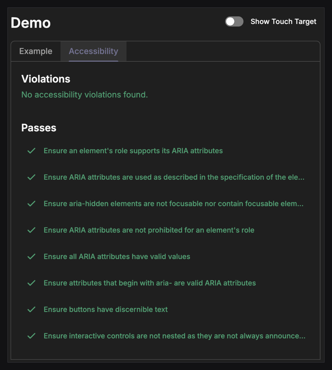
Accessibility also had to move upstream into the design specs. I pushed for touch targets on every button size, including icon-only buttons, and design confirmed a 44 by 44 or 48 by 48 minimum. I asked to replace "desktop" and "mobile" in the specs with "non-touch" and "touch screen", because the rule depends on how someone is interacting, not on screen width, and the two had started to blur. I flagged that a stepper's increment buttons are separately focusable and so need their own visible focus state. When a carousel's page dots were made decorative because they were too small to tap, I proposed treating the control like a scrollbar, so it could stay interactive and stay accessible.
That tooling mattered more than I expected. Partway through the project the team no longer had a dedicated accessibility reviewer, and the open review tickets were closed with a note that we were relying on dev checks and automated testing.
The checks were built into the tooling, so accessibility didn't depend on one person being there.
Built for change
Design direction changed often during the project, and the people on the design team changed partway through. My team's response was architectural. We built components that could absorb design changes quickly, and gave teams a scoped way to deviate when a product really did need something different, so they didn't have to fork.
The mechanism is deliberate. No component accepts a className, so there is no way to restyle one from outside. What every component accepts is a style prop typed to take CSS custom properties, so a team that needs a different border radius on one button sets that token on that element and nowhere else. The override is visible in the markup, scoped to that subtree, and can't leak. Components also take an owner prop that renders as a data attribute, so a parent can target its own children without reaching for a global selector.
Teams that adopted BSPK told us the same thing: using the components meant matching the designs, with no extra work. When a designer needed something the library didn't have, the change went through design review and we updated the component.
Knowing the platform also let us cut scope. The file upload spec had an error state for unsupported file types, but the browser's own file picker already blocks those files, so that error could never fire. We worked with design to remove it. A custom scrollbar request turned out to mean replacing an operating system control, so it became a scoped future request instead of a quiet half-build.
One stylesheet, two frameworks
We built the React library by hand, before the company granted the team access to AI coding tools. When it came time for Angular development, we used AI to port the components, and we reused the React component stylesheets and CSS custom properties exactly. Because the styles and tokens lived in CSS and not in framework code, both libraries render essentially the same DOM, look the same, and behave the same for assistive technology. The Angular library has 88 components.
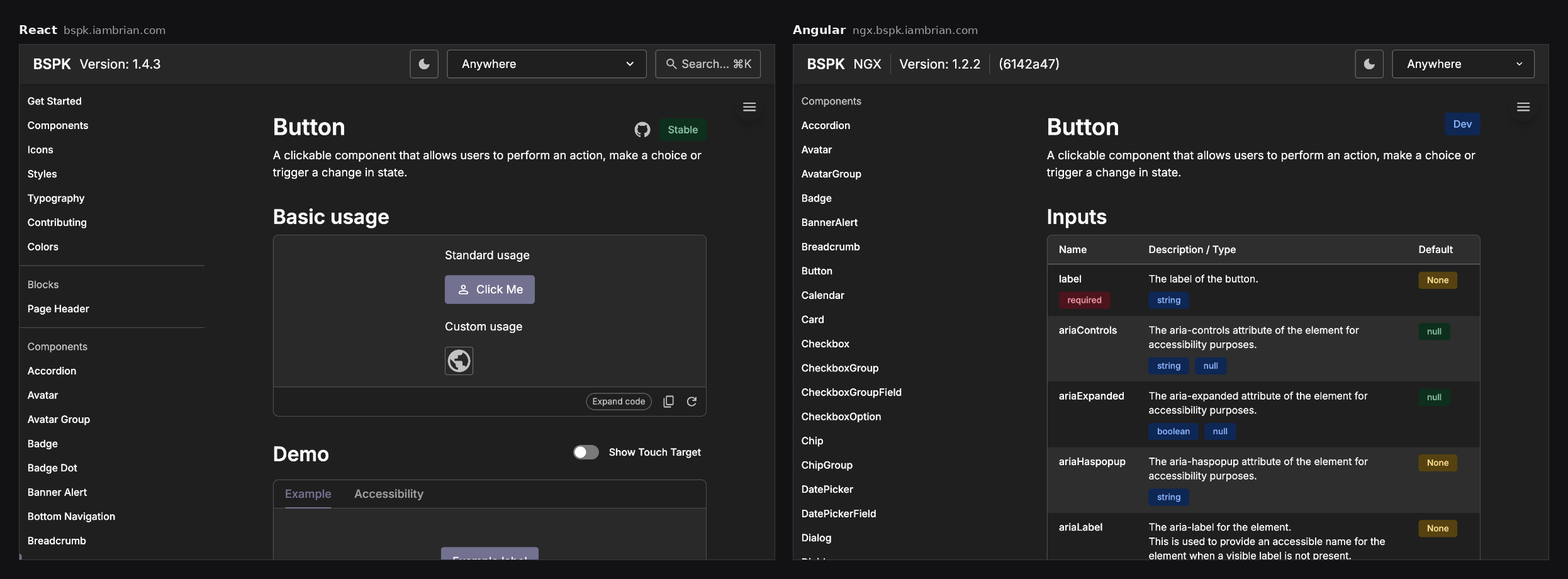
That's the strongest argument I know for keeping presentation out of the framework, and it shaped how I'm building what comes next. Both docs sites are still live, so you can compare them: bspk.iambrian.com and ngx.bspk.iambrian.com.
Building with AI
The React library predates the team having AI coding tools at all; every one of its components was written by hand. The Angular library is the opposite case, and the two sit side by side as a fair comparison.
By the time Angular was on the roadmap the company had granted access to AI coding tools, and we used them to port the components. The port had a strict brief: reuse the React stylesheets and CSS custom properties exactly, produce the same DOM, and pass the same accessibility checks. That brief is what made the port tractable. The hard part of a component, its visual and accessible behaviour, was already settled in CSS and in the React reference, so the tools were translating a known answer into a second framework rather than inventing one. Eighty-eight components came out the other side, and the two docs sites still match.
AI did the typing. The stylesheets, the reference implementation and the checks did the thinking.
That experience is why the next system treats AI as a consumer, not just a contributor. An engineer's coding assistant reaches for whatever library it saw most in training, so a design system it cannot see is one it will route around. The MCP server described under What I'd do differently gives it the real components, icons and tokens, and the same build rules that failed BSPK on an unknown variable validate what the model writes.
Getting it open sourced
Anywhere had an open-source policy that nobody had ever used. In May 2025 I filed the paperwork and made the case, mostly for visibility: I wanted the engineering side of the system somewhere other teams and vendors could find it and build on it, rather than hidden behind an internal registry. BSPK became the company's first open-source project, and its five repositories are still the only public ones in the company's GitHub organization. It was released under CC BY 4.0 and published to the public npm registry.
Four months later, Compass announced it was acquiring Anywhere. Compass had its own design system, and it was clear BSPK would be retired. We kept building anyway, because teams were shipping on it, and the work ran through to March 2026.
Being open source is what let it outlive that decision. In April 2026, after the design system was officially no longer supported, engineers on other teams were still asking for a React 19 upgrade. I told them where things stood: the funded work was over, but BSPK is open source, and if they sent the change I'd review it and publish the package.
What I'd do differently
I went back through all five repositories for this write-up, and not everything held up. Each item below is something I'm doing differently now, and each one traces back to a specific thing that happened on Bespoke.
The accessibility test that was supposed to scan every component across all ten brands in light and dark mode had a bug in the URL it built: a ? where an & belonged. Every run scanned the default brand in light mode. That suite was also excluded from CI, and the unit-level accessibility tests ran in a pre-commit hook that anyone could skip.
The checks existed. Nothing stopped a merge that failed them.
That mattered more than it would have on another project, because once the team lost its accessibility reviewer those checks were the whole accessibility process, and a process has to be unskippable to count. Accessibility tests become required status checks on main, the full brand and mode matrix runs in CI, and each test asserts which brand and mode it is looking at before it scans, so a bug like that one fails loudly instead of passing quietly for a year.
The requirements themselves arrived late. Touch targets, labels for icon-only controls and focus states for compound controls were pushed back into the specs from engineering, component by component, after the designs were drawn. Those belong in the component's definition before anyone draws or builds it: minimum target size, focus behaviour, required labels, keyboard model. Then the tests check the spec rather than my memory of it.
The token pipeline depended on someone copying JSON out of a Figma plugin and pasting it into the repo, and nothing recorded which Figma version produced which CSS. When design and code disagreed we couldn't tell whether the export was stale or the build was wrong. The plugin should write the stylesheet itself, or open the pull request, so export and build are one traceable step with the Figma version in the commit.
The Angular port was kept in step with React by hand. Sharing the stylesheets was the right call, and it proved the presentation layer didn't care which framework rendered it. The expensive part was the second implementation of the behaviour. Given that proof, the second target should be web components, so Angular, Vue and plain HTML get one implementation from one source, with the React and web component versions tested against a single shared spec rather than kept in step by discipline.
Adoption was narrower than the component count suggests. By mid-2025 a handful of products were on the packages, and the ones that were stayed on them after the funding ended. We never instrumented it, so we couldn't say with data which teams used which components at which versions, and we were arguing from anecdote. When a vendor team started rebuilding our components from scratch, it told me discoverability was a bigger problem than the components themselves. Usage gets instrumented from the first release, with a scanner that reads a consumer repo's imports and versions, so the roadmap comes from data and designers can see which components and tokens are in use.
The same discoverability problem now has a third audience. Engineers build with whatever is nearest to hand, and so do the AI coding tools they use. A system those tools can't see is one more thing they work around, and the generated code reaches for whatever library the model saw most in training. So the system ships with an MCP server: a model gets the real components, icons and tokens, and its output is validated against the same rules the build enforces, the way check-css-vars failed BSPK on an unknown variable. That's the shortest route to adoption I know of, because the correct component becomes the one the AI reaches for first.
Design systems were always guardrails for people. Now they're guardrails for generated UI too.
And ownership gets written down on day one: who owns the design language, who owns the implementation, how a design change becomes a component change, and how a product engineer contributes a component back. Bespoke had none of that in writing. It worked while the same people were in the room, and it got fragile every time someone left.
What's next
I'm building the next one. pttrn is a fork of BSPK, de-branded and consolidated into one workspace, and it's where the list above is being worked through. It isn't ready to show yet, and I'd rather point at it when it is. What it does have already is an MCP server, a Figma plugin that exports stylesheets directly, and a new design-system base, the U.S. Web Design System (USWDS).
If you're building a design system, or you need someone who has, I'd like to talk. me@iambrian.com
Built with Jessica McIntosh and the BSPK engineering and design teams at Anywhere.